


#44. How to Choose a Paint Color
And getting our house ready for a tour at the end of October

Hey!
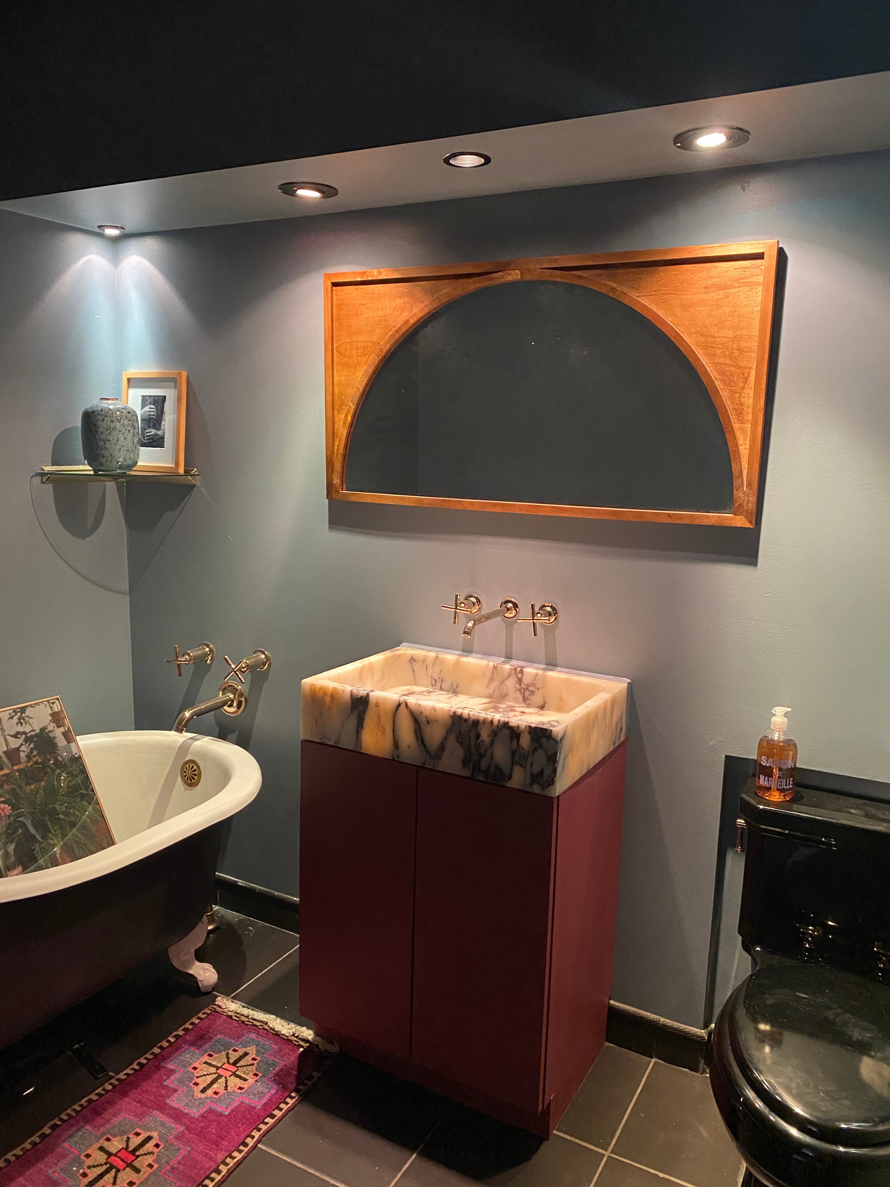
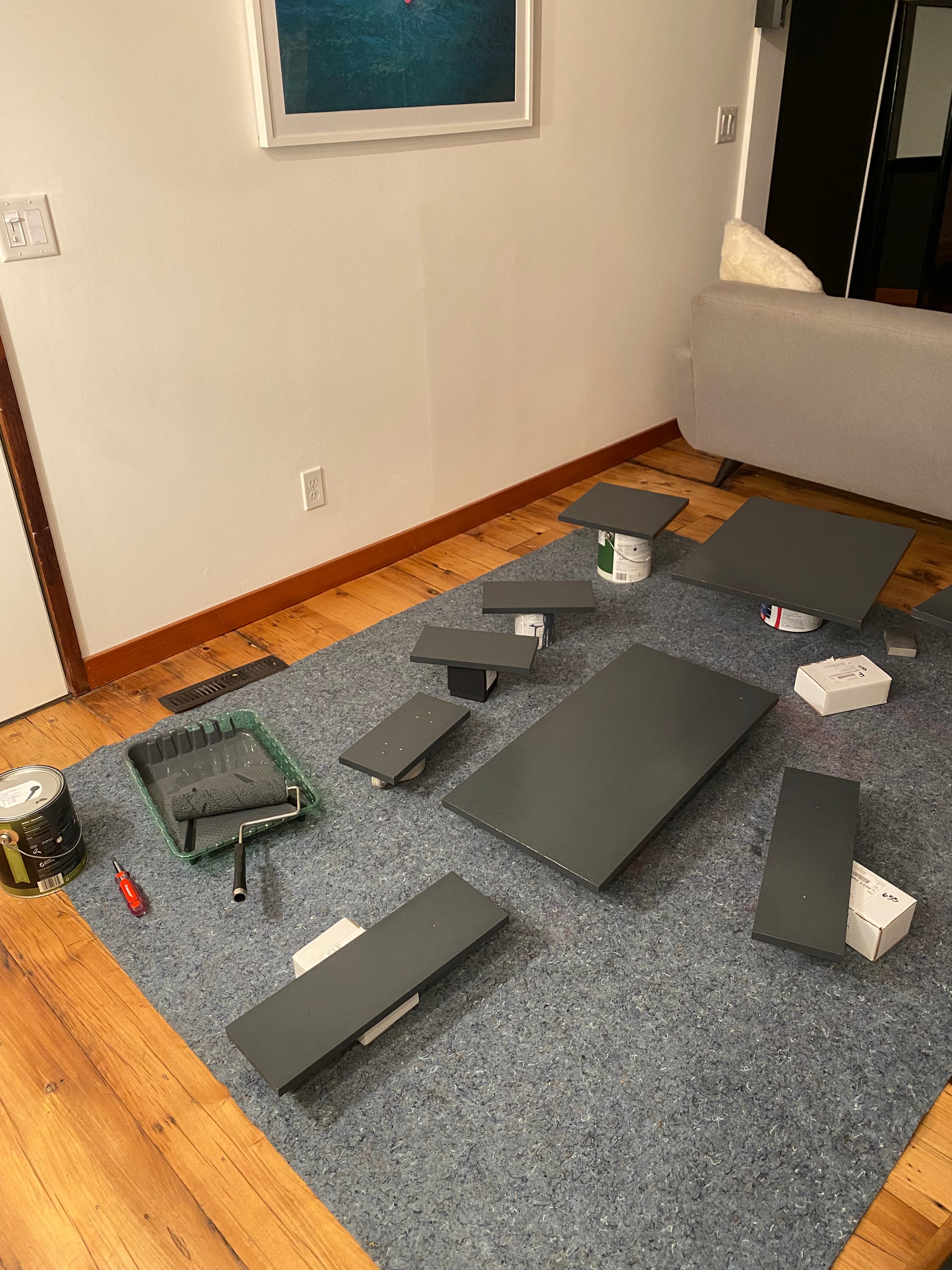
A bit of a fun change of pace this week. We’ve been deep in house projects the past few weeks because our house is being featured on an architectural tour of “Modernist Gems” later this month(!!!) and we have shit to finish! We’re super fucking busy right now, but I would be legitimately mortified to have people we don’t know (INCLUDING THE ARCHITECT WHO DESIGNED OUR HOUSE IN 1979!!) come over and see a super unfinished mess of a project. The house doesn’t have to be perfect by any means–we are still dealing with the damage from when the tree hit our house in July and there’s a random gutter hanging off our roof–but I need to finish up a few things before I’m okay with inviting a bunch of strangers inside, lol. The sink-on-the-floor situation finally came to a close two days ago after MORE THAN A YEAR and I am ecstaaaaaaaatic.
A friend of ours is actually going to video our house tour, which I am so excited for and can’t wait to share!! But in the meantime, I thought I’d do an issue on choosing paint colors; something I’ve been doing a lotttttt of this year, lol. If you’ve been in my corner of the internet for a while (especially if you watch my Instagram stories, or used to, since I randomly kind of stopped posting recently???), you know that one of my all-time favorite hobbies is that I like to paint walls. I like to paint walls so much I’ve actually started to do some color consulting for people other than myself, and it’s a damn good time.
Truly it feels like all I have been doing recently on the weekends is house projects, so I thought I’d just lean into where my brain is right now and share some of the painting knowledge I’ve accumulated over the years. You might not need it right this exact minute, but someday you might! Or maybe you’ve been thinking about painting a room in your house forever and just haven’t gotten around to choosing a color; maybe today is the day.
I’m obviously not an expert (if you have any tips or painting advice, leave them in the comments!) but here’s how I go about the process of choosing a paint color and getting ready to paint:
1. Choose a general color direction
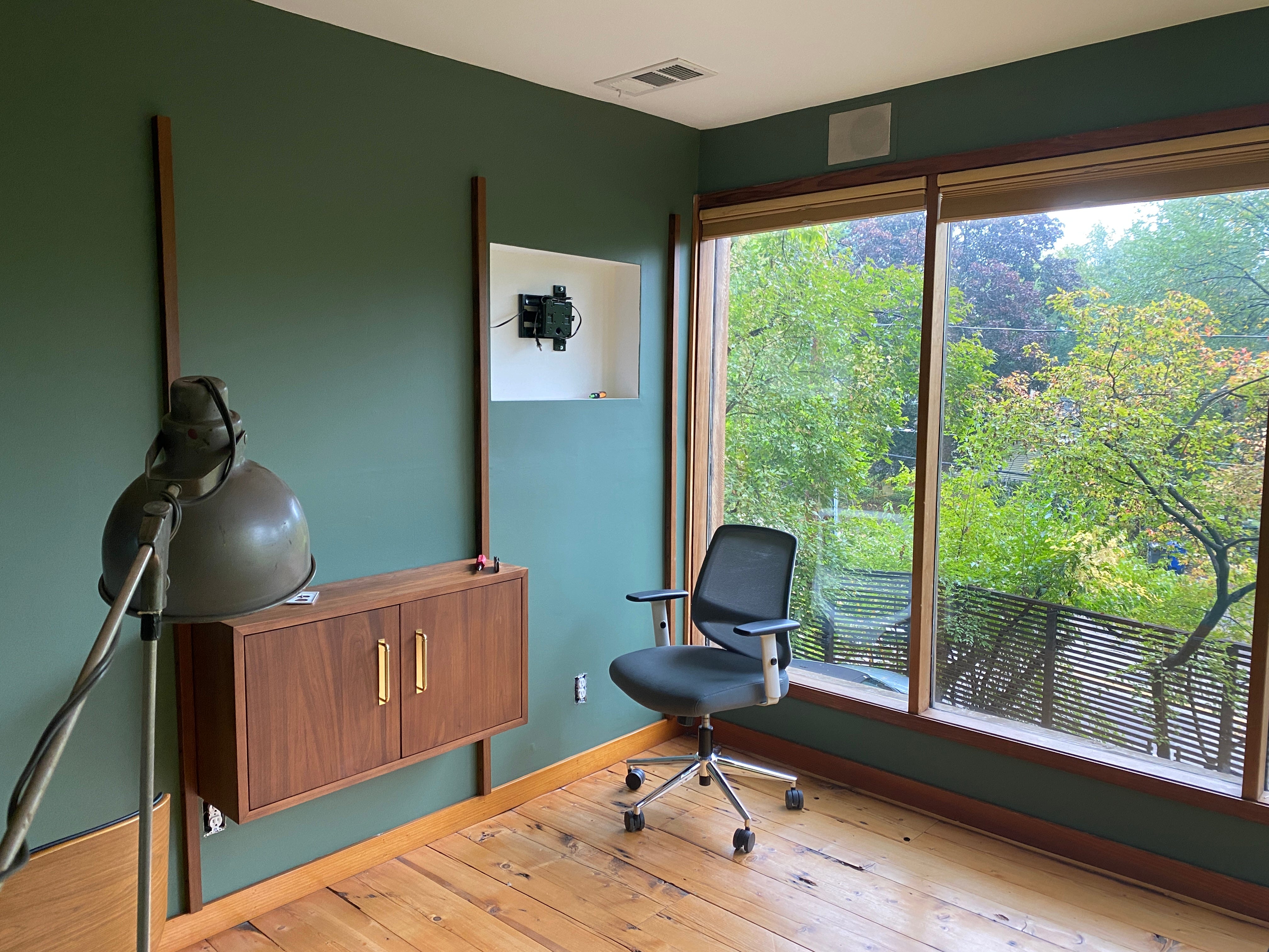
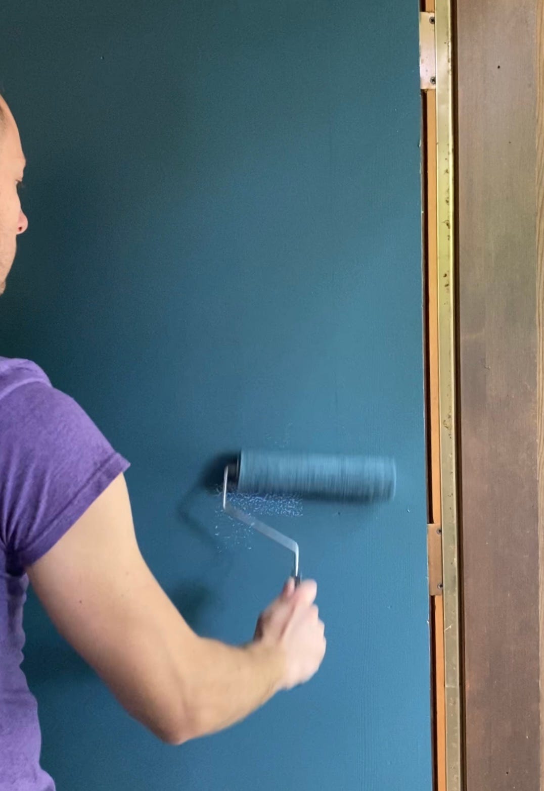
The very first thing I like to do is narrow it down to a general color direction. Am I looking for a green, blue, pink, white, or what? Sometimes a general color idea will come from someone else (we just repainted our office, and Paul decided he *had* to have a green office, so that’s what I had to go on), and sometimes I’ll look around on Pinterest for inspiration until I can decide on a general color. There are just soooo many fucking colors out there that I think it’s easiest to narrow it down to one general color first before you start sampling, if possible. You might totally change your mind later (like we did with our office; I painted it kind of a light purply grey last year and we decided it was really pretty but just too boring, so now we’re totally pivoting to green) but I’ve always found it’s easier to choose a broad category first.
2. Check Farrow & Ball’s color pamphlet

I have a pamphlet that I got for free with tiny little samples of all of the Farrow & Ball colors on it, and that’s usually where I like to start my color selection journey. Farrow & Ball has only 132 colors in their catalog and a ton of photos on their website of each color in real people’s homes, which makes it so much easier to narrow down to one or two “inspiration” colors quickly. Then you can kind of look at the Farrow & Ball color(s) and say, I think that’s close, but maybe a little darker, a little bluer, a little more saturated, etc. and go from there to find your final color.
Sometimes I’ll actually find the perfect color in Farrow & Ball’s catalog, and that eliminates some steps in the process. I’ve bought F&B peel-and-stick samples from Samplize before, but I also have at least 15 little Farrow & Ball paint pots hanging around my house at the moment, and I’m not mad about it. The Farrow & Ball brand really works for me but it’s definitely not for everyone, and we only recently got a paint store in Minneapolis that can even mix F&B paint on site which was a game changer (otherwise you have to order it from England and I’m usually a little too impatient for that). For anyone else near me, it’s the Hirschfield’s in Edina (because of course it is).
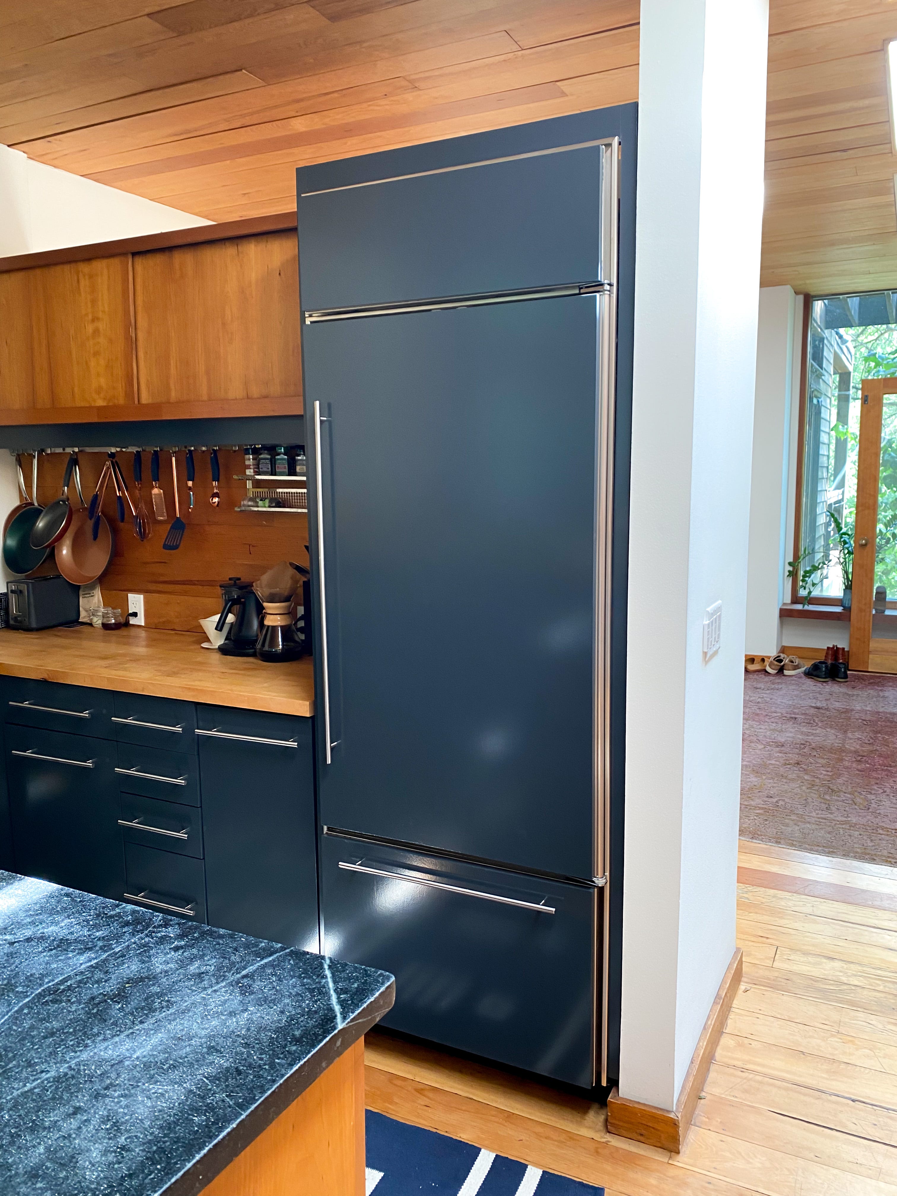
If you love a F&B color, you can also get it color matched. We painted our kitchen cabinets a Benjamin Moore color match of Railings last year and it’s a completely perfect color, 10/10, no notes. I also painted our bathroom Selvedge after testing both it and De Nimes and loved Selvedge so much I splurged on actual Farrow & Ball paint, which is $130/gallon PLUS TAX. We did our color match of Railings at Ace Hardware which is the way to go if you want to save a little money, especially if you’re painting something that needs more than one gallon of paint, eeeeeeeep. Just tell them what you want and they probably have it in their computer system already (that’s always been the case for me when I’ve done color matching). If not though, you can bring in a peel-and-stick sample or a paint pot and have them color match it that way.
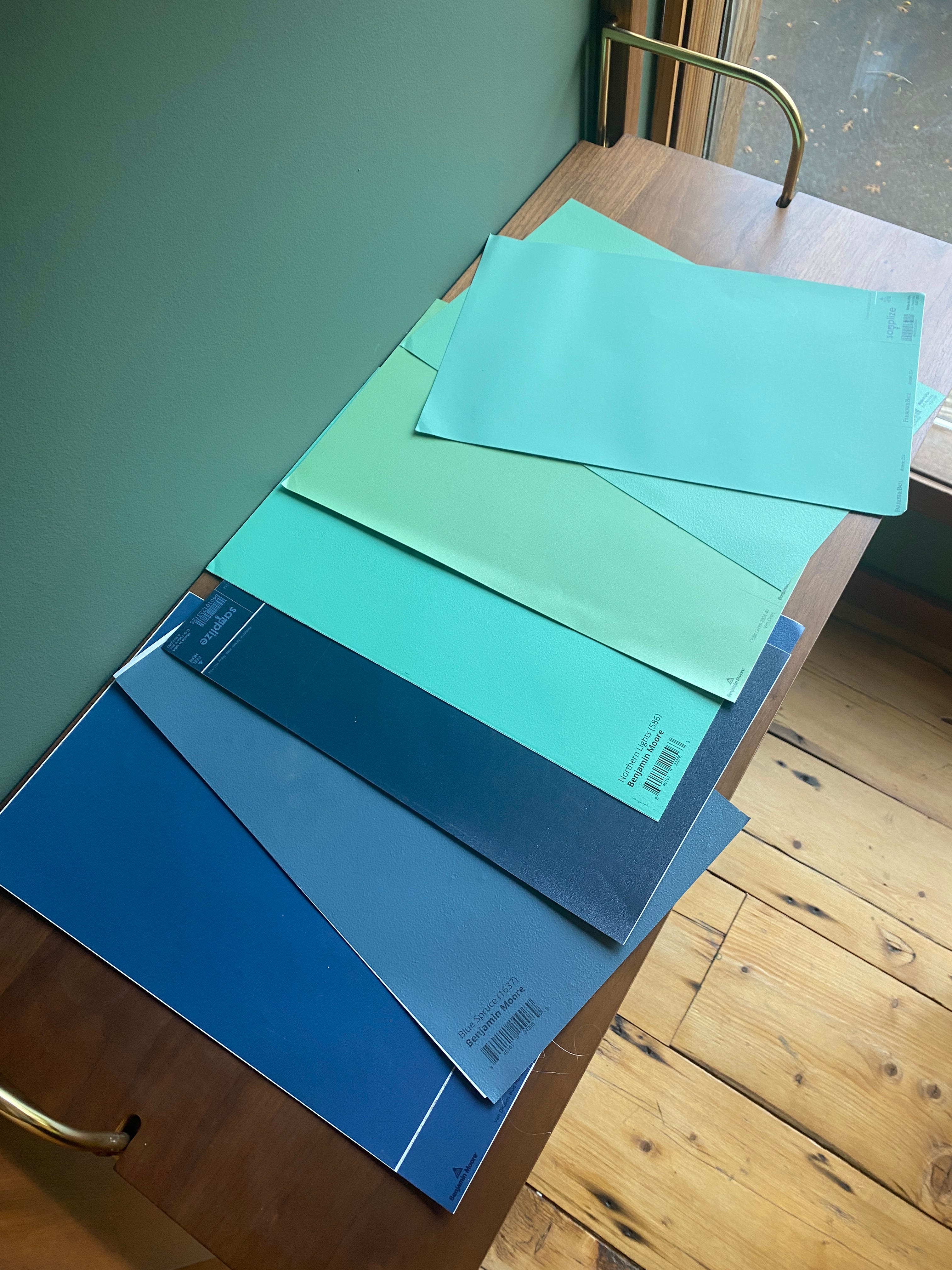
3. Look for similar colors online at Benjamin Moore
Farrow & Ball is definitely my favorite paint company, but Benjamin Moore is up there too. Where Farrow & Ball is expensive AF and hard to get, Benjamin Moore is super widely available and their website is sooooo much easier and better to use than Sherwin Williams and BEHR, in my opinion. Once I have a target color in mind from Farrow & Ball, sometimes I’ll Google the Benjamin Moore equivalent to get me started, and then go to that color on their website (or sometimes I’ll just eyeball it). They’ll show you similar colors at the bottom of each paint color’s page, and then I just keep looking until I collect a few that I like and want to sample.
For our office, we went through a LOT of different directions for the kind of green we were looking for before we narrowed in on F&B’s Green Smoke as our inspiration color. I Googled that the color match for it was Lush by Benjamin Moore, and then found our color, Cushing Green, in the recommendations on the page for Lush.
Another thing I like to do once I find a paint color I think I like is to search Pinterest for the color. Depending on the color, you might get a ton of hits of how the color looks in different spaces, and that can help you envision whether it’s the right color for you before you sample. Every color will look totally different depending on the space, but getting a vibe check from Pinterest can be super helpful.
4. Buy peel-and-stick samples from Samplize
Sometimes I like to cast a wide net and buy a bunch of peel-and-stick samples from Samplize. Samples are decently priced at $5.95 (Farrow & Ball’s are $7.95) and I like that I can just order them from my couch, they aren’t at all messy, and they arrive super fast. I’ve used Samplize enough to know that I’ll usually use them for my first round of samples, but not the final selection. Even though they are real paint samples, they’re not large enough to make an accurate color selection if you have a tough color or you’re super picky. Samplize usually helps me find a final two or three, and then I’ll buy real paint samples to make a final decision.
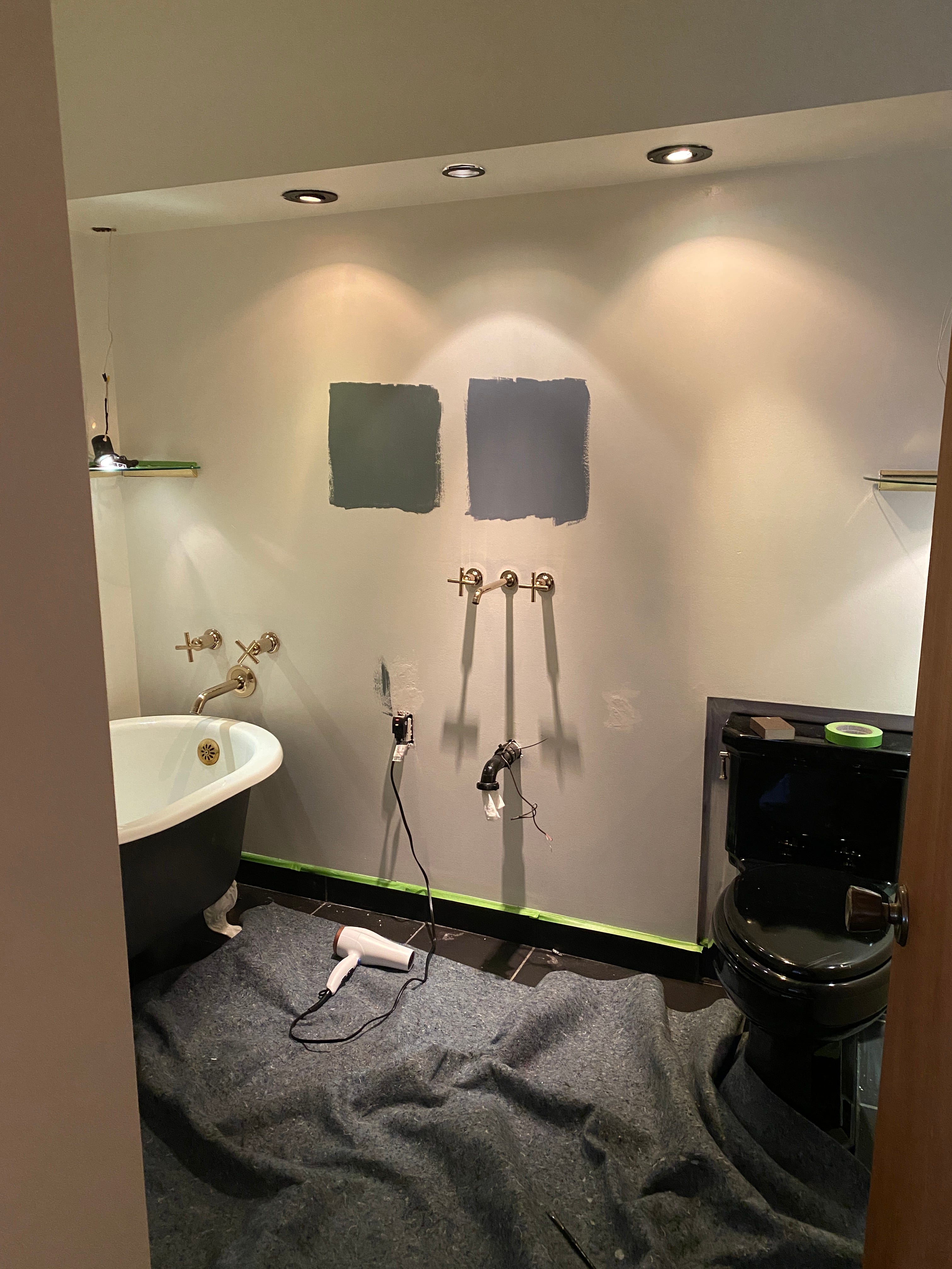
A helpful tip–if you skip the next step and make your final decision with just peel-and-stick samples, make sure to choose a color that is slightly more neutral/ less saturated than you’re looking for. Once a color is all over the walls, the overall effect of the color will be a bit bigger/bolder because there will be a lot more of it. So if you’re debating between two colors, and you’re worried one will be slightly “too green” or “too blue” or whatever, it will be. I’ve made this mistake enough times to know how to correct for it.
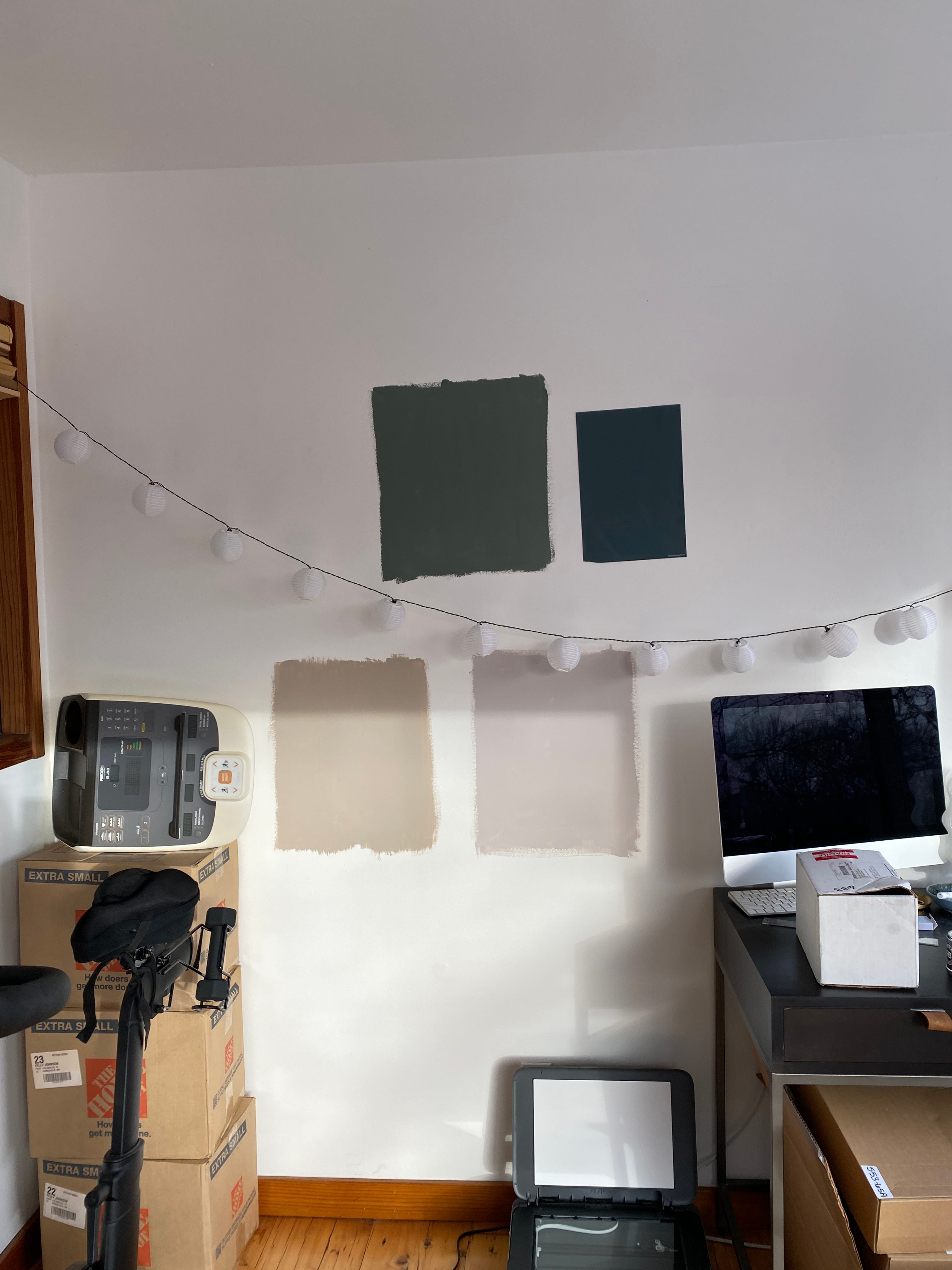
5. Buy real paint samples and white poster board
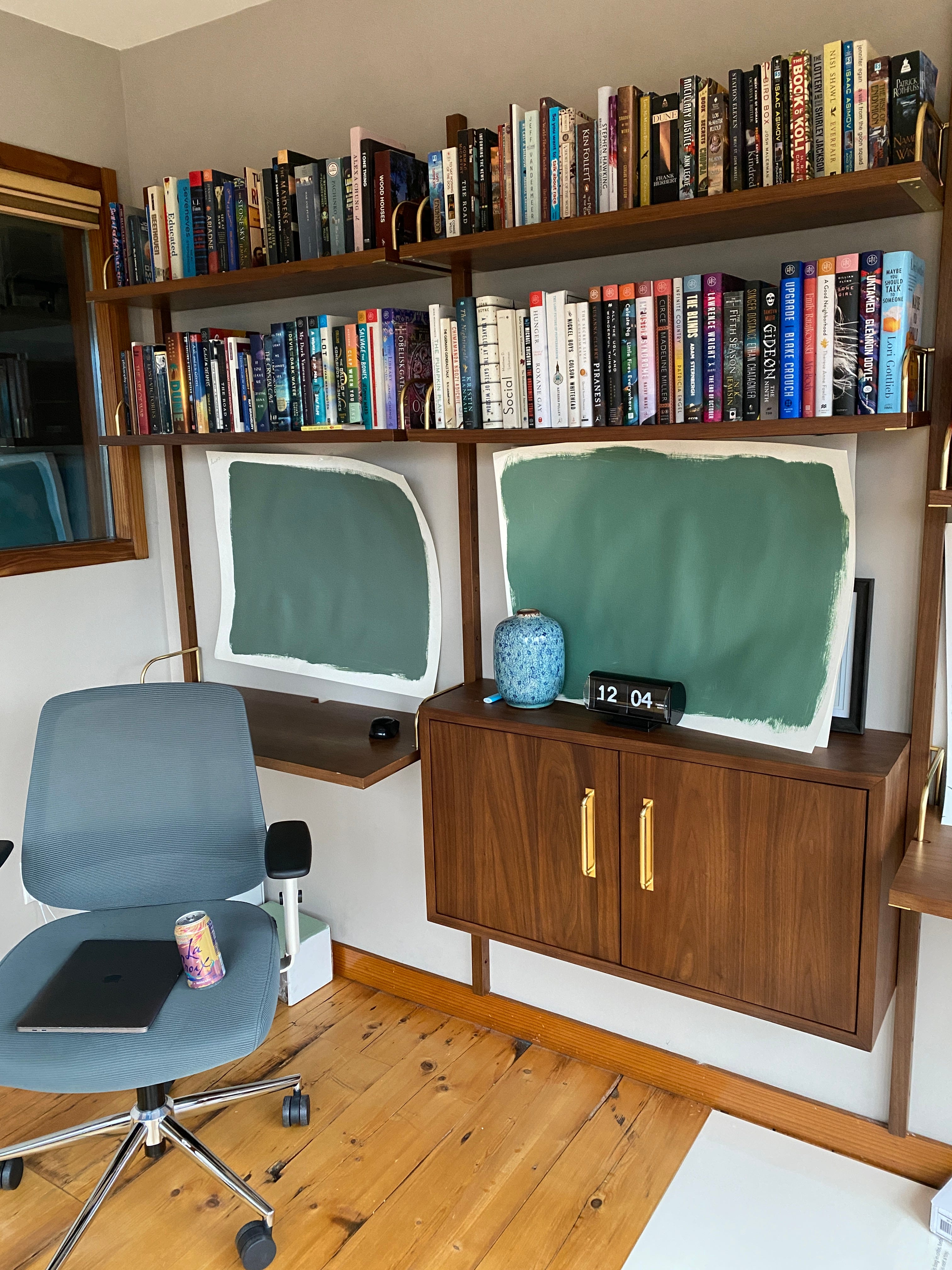
Instead of painting your samples directly on the wall (which you can do, but sometimes you’ll have to paint over them with an extra layer of paint or they will show through even two coats, or if you decide not to paint the wall at all you’re kind of fucked), I like to paint my samples on pieces of white poster board. I made this change somewhat recently, but I’m convinced this is the way to go. You can get a pack of them for less than $10 at Target or CVS, and they will allow you to see the color large enough to know what it will actually look like. Leave a small white border around the outside so you’re comparing the color to pure white, instead of whatever color is already on the wall.
6. Or just fucking wing it
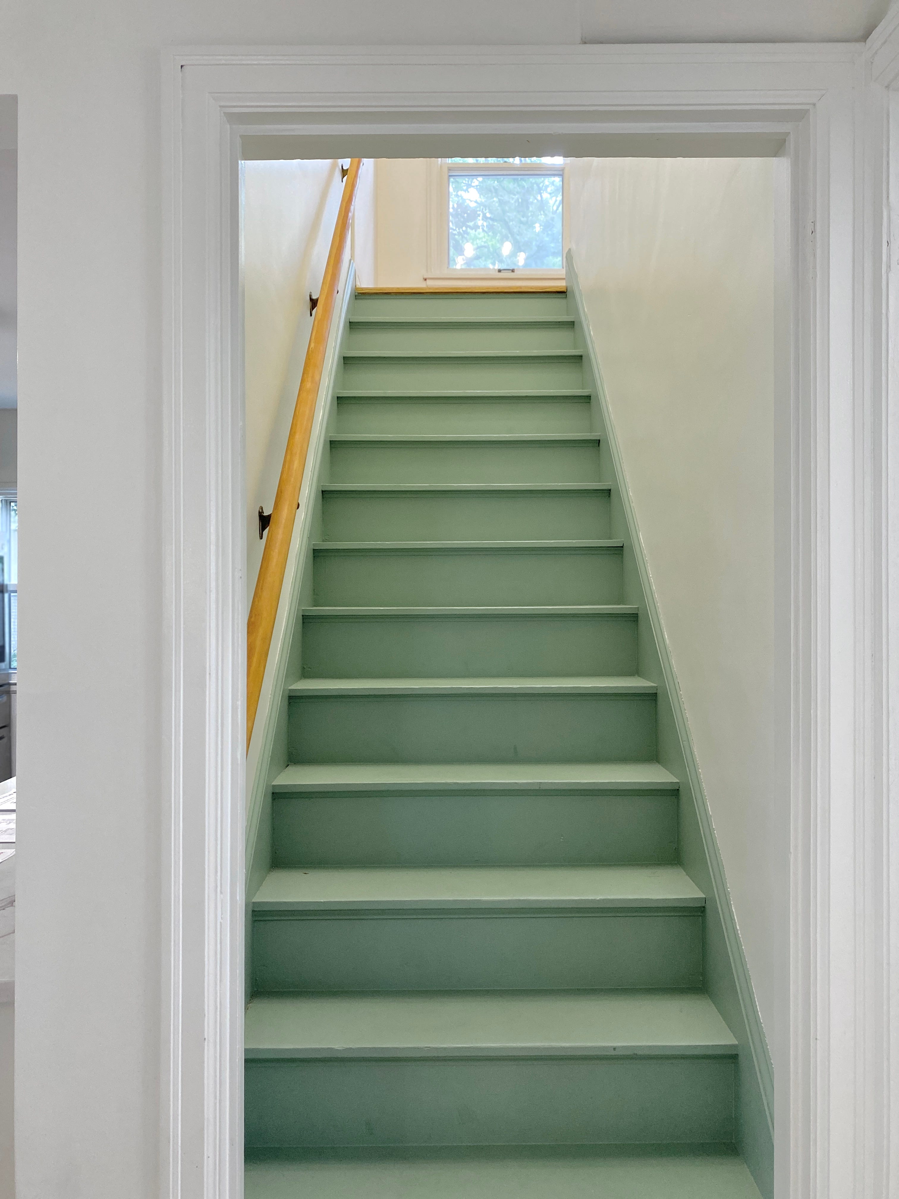
Here’s a secret: A few times recently I’ve chosen a paint color without doing any sampling at all, and shockingly, it usually works out okay? Even if it isn’t perfectly what I was looking for, it’s close enough. I did this with the painted stairs and the front door in the house I designed this summer–the painted stairs ended up being PERFECT, and the front door wasn’t quite it, but it was pretty anyway. We also picked the color for our vanity on the first shot (our project this weekend) and I’m honestly really happy with it!!
This approach isn’t for everyone though. It might turn out to be totally different than you thought and paint isn’t cheap, so this method is really only for people who don’t totally give a fuck about the final outcome and long as it’s painted and in the right general ballpark.
7. Choose your color, and get your paint!
Once you’ve decided on a color, you can order online or head to your local store. Once you know the color, you’ll also need to know what brand of paint you want, what quality level, and what sheen. This is honestly the part that I didn’t really start paying that much attention to until this year. Paint is just paint, right? Um no. Personally, I like to buy the best quality option if you need a gallon or less (like for one small room, cabinets, a vanity, etc.) because you truly notice a difference with better paint, and I like Benjamin Moore’s Aura line the best of pretty much every paint I’ve tried. (I also like Clare Paint and Farrow & Ball.)
In terms of sheen, it depends on what you’re doing, but here’s what I like:
Cabinets and doors – Benjamin Moore’s Aura semigloss paint is where it’s at. It’s probably the best paint I’ve ever used, and our kitchen cabinets truly look professional; people are shocked when we say we did them ourselves. That being said, I did just use Aura paint in eggshell for our new bathroom vanity (we painted it dark pink and felt strongly we didn’t want it to be pink AND glossy, hey Barbie) and we’ll see how we feel about that decision in the coming weeks.
Bedrooms, offices, living rooms; rooms with low traffic and low moisture – I’ll usually go with Benjamin Moore Aura in matte or eggshell or Farrow & Ball Estate Emulsion (this is definitely a love-it-or-hate-it-paint). Clare Paint in eggshell is also a favorite too, if you’re into ordering paint from the internet. Paul also loves Benjamin Moore Regal Select in any finish.
Bathrooms, kitchens, or kids’ rooms – I loooooove Farrow & Ball’s Modern Emulsion paint (their version of eggshell). A lot of people will tell you to use semi-gloss in bathrooms because of the water exposure… but I hate how semi-gloss paint looks on interior walls, like absolutely hate it. We have some in our house right now on two little experimental accent walls and every time I look at it, it drives me nuts. Farrow & Ball is the only paint I could find last year that has a matte finish but is still water resistant and wipeable. (Benjamin Moore’s Aura line also has a matte “bath and spa” option that somehow I missed, but I’m pretty sure is the same thing?)
8. Gather your supplies
If you’re going to paint yourself, here’s a list of my go-to supplies I like to grab when I’m at the paint store waiting for my paint to shake:
Frog tape (in the green package)
A fresh roller and roller cage if you need one (make sure you grab one that will work for what you are doing, usually a smooth to semi-smooth surfaces roller cover will be fine. When in doubt, ask someone who works there!)
A smaller 1.5” or 2” brush, I like an angled edge but don’t *need* it
A plastic paint tray or two
A stir stick (they’re free)
If you’re doing a ceiling, or you have vaulted ceilings, or even if you just want to go quickly, a paint pole. I bought mine on a whim for $27 from Clare Paint and I love her so much
If you’re doing a piece of furniture or cabinets, you might need a mini roller
A metal tray to set your tray liner in is nice to have, but you don’t *need* it
You’ll also need (and might already have):
Something to cover your floor (you can buy a big plastic sheet at the paint store if you want to be all official about it)
A screwdriver to remove your light switch covers, and to open your paint can (unless you want to buy a real paint can opener, I do have one)
Paper towels for spills
A super small paint brush for touchups, like from the art aisle
A super super sturdy chair or a three-step stool (I bought mine in L.A. for $80 which was an investment but I brought it with me to Minnesota and damn I use that thing so much)
A few specific color recommendations…
Here are my three go-to, never fail paint colors that literally never let me down and are always a 10/10 would recommend:


Simply White by Benjamin Moore: If you’re about to tear your hair out trying to pick a white (which can be absolutely maddening!!), Simply White is pretty much always a safe bet, in my opinion. It’s a pretty pure white that isn’t *too* white and has subtle creamy/warm undertones. It is, simply, white. (Sorry).
Shoji White by Sherwin Williams: Shoji White is a truly magical alternative to white. It’s a light, light beige that looks like a creamy white except when you compare it to pure white. It’s like a more relaxed version of white, for when you aren’t 100% sold on pure white walls but want something lighter and more chic than gray or beige. I’ve also heard a lot of good things about Swiss Coffee by Benjamin Moore which has a similar effect to Shoji White, but is lighter. Someday I’ll use it and will report back.
Railings by Farrow & Ball: An alternative to navy blue that is truly a neutral that can be used in so many different situations, but is especially good on cabinets, furniture, and front doors.
Aaaaand all of the paint colors currently in my house:


Simply White by Benjamin Moore (all over the house)
Railings by Farrow & Ball (kitchen cabinets and an accent wall in our bathroom)
Selvedge by Farrow & Ball (middle level bathroom)
Newburg Green by Benjamin Moore (front door and entryway accent wall)
Cushing Green by Benjamin Moore (office)
Old Claret by Benjamin Moore (bathroom vanity)
And a few more favorites I’ve used in the past on different projects:


Light Blue by Farrow & Ball
De Nimes by Farrow & Ball
Elephant’s Breath by Farrow & Ball
Chill by Clare Paint
Salamander by Benjamin Moore
Scenic Drive by Benjamin Moore
IF YOU NEED MORE HELP than this, please email or DM me!! I love helping people choose paint colors and would be happy to throw a few options at ya.
K bye,
Kelly
100% yes on painting samples on poster board instead of on the wall! The other benefit is that you can move them from one wall to another in the room to see how the light hits differently without having to paint more swatches.
I’m a Behr Ultra girlie because their matte paint is so scrubbable! Consumer Reports rates all three of the Behr paint lines higher than Benjamin Moore, Sherwin Williams, and F&B.
Also, Sherwin Williams is a trash company that I urge no one to support - my friend’s grad school classmate lost one of her eyes after she was run over by a Sherwin Williams corporate employee driving home drunk after a company holiday party.
A comment for people who want to use yellow. Be very careful if the room will be getting sunlight. The sun makes the paint color WAY more yellow - banana! I totally repainted my great room because of this - I ended up repainting with a tan color which looks perfect in that bright room and actually looks a little yellow in the sun. But the bedrooms where I used the original yellow color, which don't get much sun, are fine.